Depending on the type of report you generate, you may see different kinds of graphs, and possibly a data table to help you visualize your data.
Graphs #
Whether its a line graph or a bar graph, simply hover your mouse over the graph to see more information.
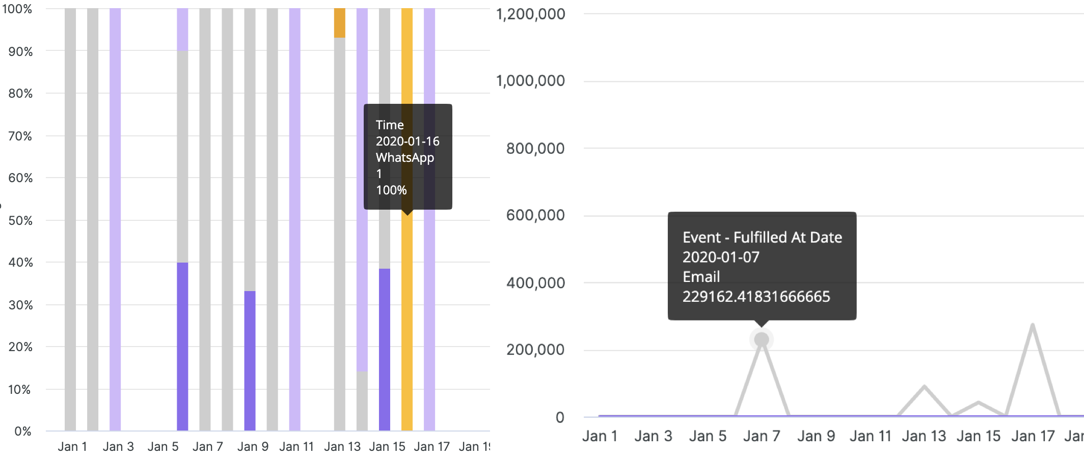
- When hovering over a graph, the date format you’ll on the UI is YYYY-MM-DD, and the date on the X-axis is MM-DD.
On some reports, right below the graph, you can also click on the report specific filters to hide or show data on the graph.
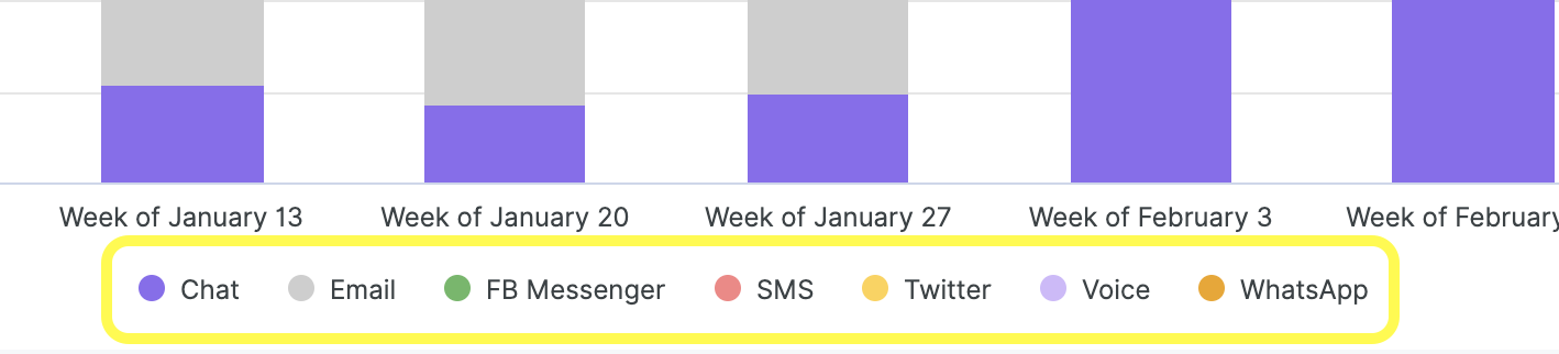
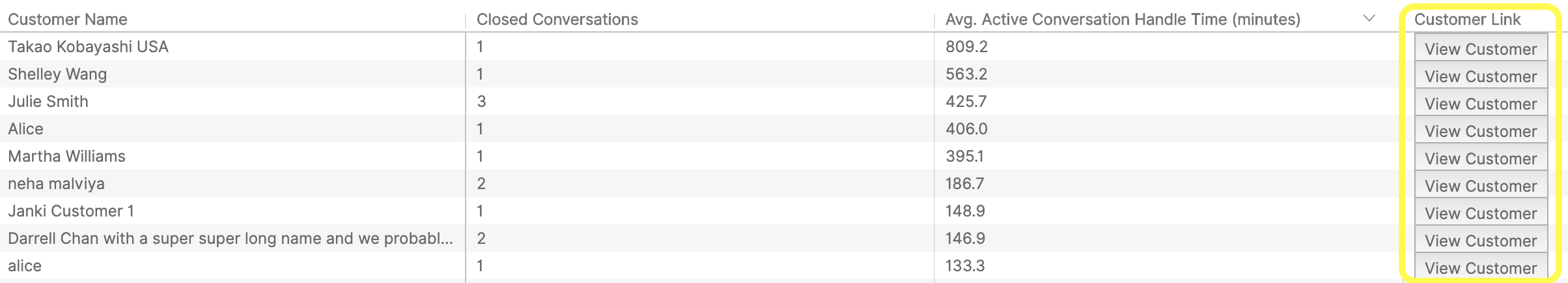
Table #
Use the table view to help you cross-reference data your report. The data on the table will, of course, differ based on the type of report you generated
- Note – Tables are limited to displaying 5k rows in the UI. You must export the report as a CSV to see the rest of the rows. Also, rows with no data (null) will not be displayed.
On certain reports, the table will have a Customer Link column. Clicking on View Customer will take you directly to the Customer’s Profile in Gladly.