Out-of-the-box (OOTB) dashboards are a collection of the most commonly used reports that provide performance glimpses and display Key Performance Indicators (KPI) metrics in Gladly. While pre-built, out-of-the-box reports like the Agent Duration and Conversation Timestamps report help answer specific questions, the OOTB dashboards collect the most valuable and frequently used reports and metrics without downloading, stitching, and manipulating CSVs to gain insight.
Benefits of OOTB dashboards #
- Provides visually rich data to help contact center managers scan critical metrics and feel informed.
- Get a sense of your contact center performance swiftly.
- While Gladly provides rich data tables and some single-metric visual reports, they require additional work requiring the combination of various reports to arrive at a high-level visual view. OOTB dashboards reduce the need for manual data manipulation.
List OOTB dashboards #
There are currently two OOTB dashboards available. Each dashboard was meticulously researched and developed to help managers gain insight into the state of their contact center.
Daily Trends #
Designed for contact center managers and decision-makers, it provides insight into how the entire contact center is doing for the day — or a range of days — and how the team performs against your goals and metrics for decision-making purposes. You can view insights like:
- Channel Mix
- Conversation Handle Time or Close Time
- Most used Topics
- SLA performance
- Top 10 Topics Applied
A complete list of tiles for the Daily Trends dashboard is available here.
Coaching Dashboard #
Provide people managers easy access to individual Agent-level metrics for coaching and opportunity reasons. Containing a range of filters — including Date, Date Granularity, Name, Email, and Team — managers can quickly discuss performance and opportunities for insights like:
- Logged In and Active Time
- Availability
- Number of Contacts
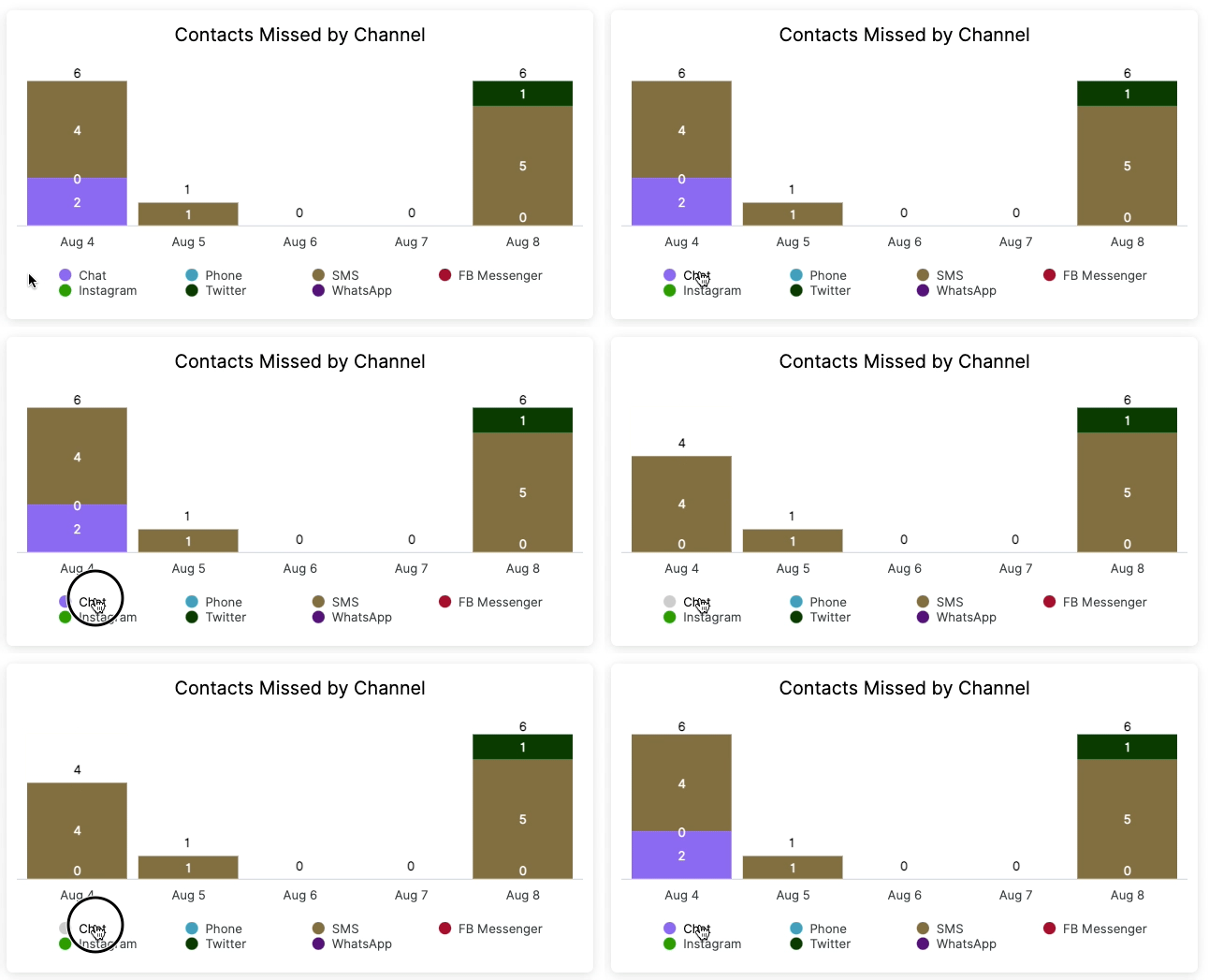
- Contacts missed by Channel
A complete list of report tiles for the Coaching Dashboard is available here.
Topics Dashboard #
Conversations associated with certain Topics can help contact center managers comprehend the types of queries Customers ask. Popular or trending Topics allow managers to proactively address developing issues or identify areas requiring attention. Insights include:
- Count
- FCR%
- Avg Conversation Handle Time
- Overall Topics
A complete list of report tiles for the Topic Dashboard is available here.
Sidekick Dashboard #
Gain insights into how Sidekick is performing. Use the dashboard to understand how Sidekick is reducing costs for your Contact Center, where it is performing well (based on your Customers’ contact reasons), and where you have opportunities for improvement. Insights include:
- Resolution and Expected Handoff Rates
- Assisted Conversations by Channel
- Resolutions by Channel
- Top Contact Reasons
A complete list of report tiles for the Sidekick Dashboard is available here.
Dashboard report tiles #
Report tiles are single — visually rich — reports found in a dashboard. Depending on the report, data in each report tile is presented in various ways, from line graphs and pie charts to simple numeric metrics.
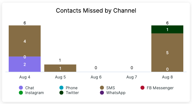 | 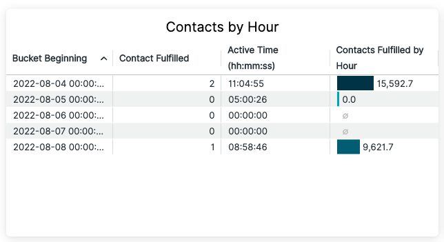 |
Data presented in the dashboard report tiles are also available in OOTB reports, though sometimes, additional manipulation is needed to get to the same data. For example, Unique Customers is a metric in the Conversation Summary report. Contact Transferred can also be found in the Agent Summary report.
Interact with a report tile #
You can manipulate tiles to hide or expose specific data points. Tile manipulation options depend on the type of visualization used for a report tile. You can:
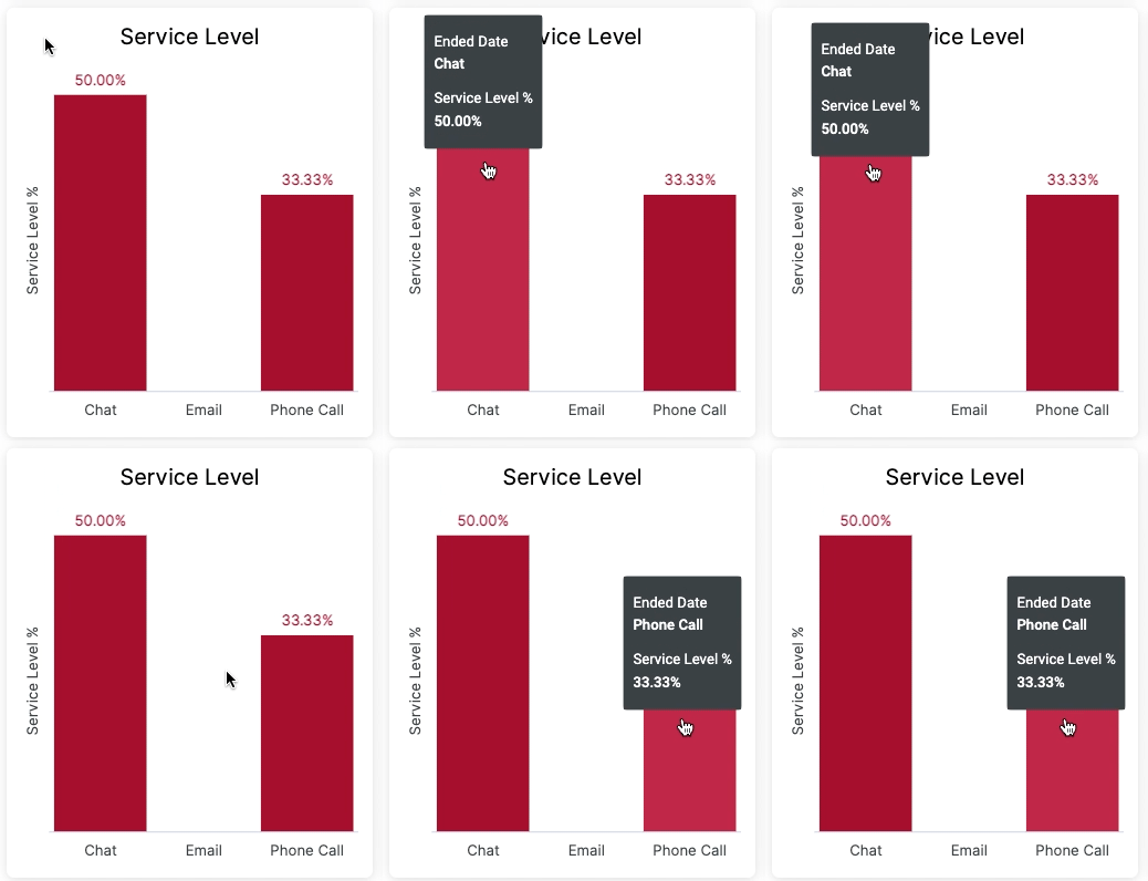
- Hover over tile elements (e.g., bar, line, etc.) to see more data.

- In the Contacts Missed by Channel report tile, clicking a Channel at the bottom allows you to hide specific Channels from the bar graph.

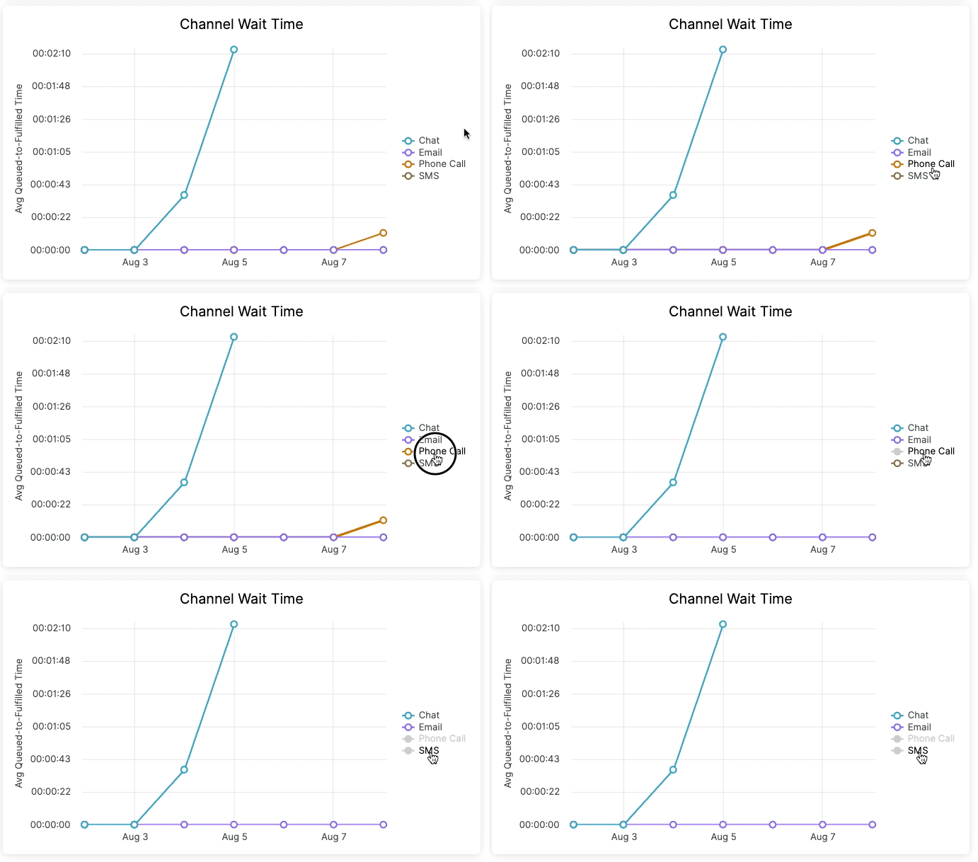
- In the Channel Wait Time report tile, you can click a Channel(s) to hide a Channel’s data from the graph if you want to focus on viewing data for specific Channels.

Feel free to interact with every tile to learn how to manipulate the data visually.
Dashboard filters #
Each dashboard has its own set of filters to allow you to modify or limit data in the dashboard.
Do keep in mind the following when applying filers to a dashboard:
- Filters in each dashboard apply globally, meaning you cannot set filters for a particular report tile.
- You cannot change the types of filters available, but we may introduce others in the future.
- You must click the refresh button to load new data after updating filters.
Daily Trendsn Dashboard filters #

Filter by:
- Date Range – View dashboard data by date and access multiple options to view data by varying ranges. The default filter is in the last seven days.
- Inbox – View dashboard data by Inbox. Each tile presents a tile’s data based on the Inbox filter.
- Channel – View dashboard data based on the Channel filter. Each tile presents a tile’s data based on the Channel filter.
Coaching Dashboard filters #

Filter by:
- Date – View dashboard data by date and have access to multiple options to view data by varying ranges.
- Date Granularity – View date granularity: 30 minutes, Daily, Weekly, Monthly, Quarterly.
- Name – Filter Agents by name. To filter select Agents by name, use the Is option to see a list of Agents.
- Email – Filter Agents by email address. To filter select Agents by their email address, use the Is option to see a list of Agents.
- Team – Filter Agents by Team. To filter select Agents by Team, use the Is option to see a list of Agents.
- User Status – Filter Agents based on user status. Check Active only to display active users.
Topics Dashboard filters #

Filter by:
- Date – View dashboard data by date and have access to multiple options to view data by varying ranges. The default is set to 7 days.
- 1st Channel – View dashboard data based on the Channel filter. Each tile presents a tile’s data based on the Channel filter.
- Inbox Name – Last Closed – Lists the name of the Inbox a Conversation closed with the applied Topic.
- Assigned Agent Name – Last Closed – List the name of an Agent assigned to the Conversation when the Conversation was closed with the applied Topic.
- Note – Not available in the API version of the report.
- Topic with Hierarchy – View the number of Conversations using a particular Topic hierarchy.
Sidekick Dashboard filters #
- Last Closed At Date – View Conversations that were closed during a specific time window. For example, the filter to view closed conversations within the last 7 days.
- Sidekick Conversation Channel – View dashboard data based on the Channel in which Sidekick assisted the Customer.
- Sidekick Inbox – View dashboard data based on the Inbox to which a Conversation was routed. Because you can configure Sidekick to exclude Conversations that are routed to specific Inboxes, filtering out these Inboxes from reporting will result in more accurate information about the proportion of eligible Conversations that Sidekick is Assisting and Resolving.
Time Anchors for each report tile #
Each report tile in a dashboard uses a particular (and sometimes multiple) Time Anchors.
Let’s use Unique Customers in the Daily Trends dashboard as an example. The Unique Customers report tile displays the count of unique Customers with Conversations last closed within a given time frame based on your date filter.
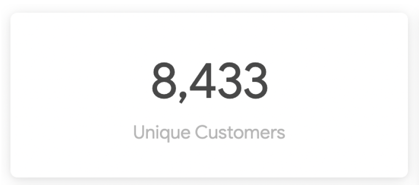
Unique Customers use Conversation Last Closed At as the Time Anchor. This means this only includes Customers who had their Conversations closed within the timeframe set on the dashboard’s filter. If the filter is set to in the last 7 days, Conversations created during this range but haven’t yet been closed are also not included.


