Background #
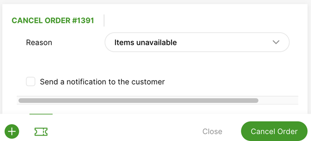
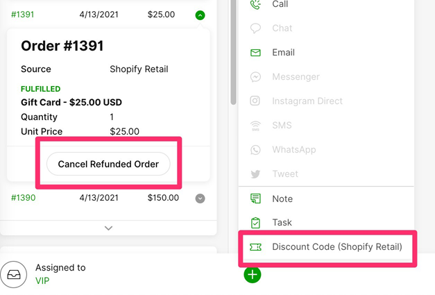
Imagine being able to add a button to a transaction card that allows an Agent to cancel an order or reactive a subscription:
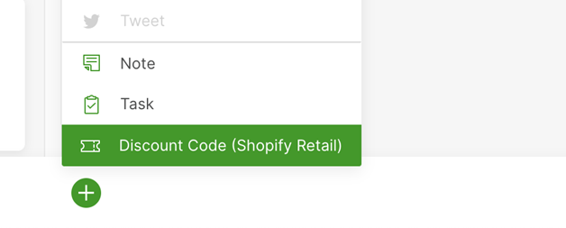
Or create a discount code:
Introduction #
Gladly Actions can be applied to two targets: Customers and ORDER/SUBSCRIPTION type Transactions. When building a custom Lookup Adaptor, you may choose to send specific and unique Actions per Customer profile and transaction. Gladly will simply display the Actions that your Lookup Adaptor sends back.
All Agents can perform any Action so long as it is returned by your Lookup Adaptor. Actions can only be performed if a Customer has already been linked (either manually or automatically).
High-Level Actions #
- Agent visits the linked Customer page, which triggers a detailed lookup to your Lookup Adaptor.
- When Gladly receives the lookup response, we display any relevant actions alongside the order, subscription, or Plus menu.
- Agent initiates an Action by selecting it in the order, subscription, or from the Plus menu.
- Gladly fetches the action form and action submit endpoint from your Lookup Adaptor and displays it to the Agent.
- Agent fills out and submits the form, which calls the submit Action endpoint specified in step four.
- If either form validation fails or action submit fails, Gladly displays errors to the Agent.
- If the action succeeds:
- Gladly logs an audit event in the conversation feed.
- Gladly refreshes the order or subscription data, which reflects updates from the action just performed.
Configuring Actions via Detailed Lookup #
To configure Actions, your Customer lookup service should respond to the Detailed Lookup request by returning an array of actions per Profile and Transaction.
Gladly uses the name of the Actions you define to display to Agents.
Example Detailed Lookup Response With Actions Configured #
Sample Detailed Lookup request response with actions on the transaction and profile level.
POST https://your-lookup-adaptor-url.com
Response
{
  "results": [
    {
      "externalCustomerId": "12345",
      "actions": [
        {
          "name": "Discount Code (Shopify Retail)",
          "formUrl": "/action?customer=12345"
        }
      ],
      "emails": [
        {
          "original": "[email protected]"
        }
      ],
      "phones": [
        {
          "original": "+16501234567",
          "type": "MOBILE"
        }
      ],
      "customAttributes": {
        "points": "$100.00"
      },
      "name": "First Last",
      "transactions": [
        {
          "type": "ORDER",
          "orderId": "12345",
          "actions": [
            {
              "name": "Cancel Refunded Order",
              "formUrl": "/cancel?customer=12345&order=12345"
            }
          ]
        }
      ]
    }
  ]
}
Action Fields #
| Field | Type | Required | Description |
|---|---|---|---|
| formUrl | URL | Yes | URL to use to fetch the actions form configuration. URL must be relative to the lookup service path defined in Settings > Apps. Uses the same authentication as your Lookup Adaptor. URL may include query parameters. URL must be in String format. |
| name | String | Yes | Display name for action button. |
Configuring the Form for a Specific Action #
When the Agent clicks the Action button, the details for the Action are retrieved. The expected response informs how the Action form display. At the bottom of the form, there are two buttons for confirming or cancelling.
Example Response and Corresponding Form #
This call occurs when an agent presses an action button on your Lookup Adaptor. Let’s use the cancel order action example above.
GET https://your-lookup-adaptor-url.com/cancel?customer=12345&order=12345
Headers
- Gladly will send a header called Gladly-Agent-Id in this request to your Lookup Adaptor. This header’s value will correspond to the Gladly Agent ID that pressed the action button (requested the action form). In your Lookup Adaptor, you can use this header to adapt the content of the Action Form to the requesting Agent. For example, if different Agents have permission to create discount codes of different values or for different products
- Note that Node.js (a popular JavaScript runtime environment) will represent this header key as gladly-agent-id (in lowercase) instead of its original Gladly-Agent-Id.
- All Agents, regardless of permission in the Lookup Adaptor, will see the Action option in the Plus Menu.
Response
{
  "actionUrl": "/actions/cancel?orderNumber=1390",
  "title": "Cancel order #1391",
  "submitButton": "Cancel Order",
  "closeButton": "Close",
  "sections": [
    {
      "type": "input",
      "label": "Reason",
      "attr": "reason",
      "input": {
        "type": "select",
        "placeholder": "Please select a reason…",
        "optional": false,
        "options": [
          {
            "text": "Order mistake",
            "value": "order-mistake"
          },
          {
            "text": "Ships too late",
            "value": "ships-late"
          }
        ]
      },
      "hint": "Cancelation reason is required"
    },
    {
      "type": "input",
      "attr": "reason",
      "defaultValue": false,
      "input": {
        "type": "checkbox",
        "text": "Send a notification to the customer"
      }
    }
  ]
}
Action Form Response Fields #
| Field | Type | Required | Description |
|---|---|---|---|
| title | String | Yes | Form title. Appears at the top of the form. |
| actionUrl | URL | Yes | Endpoint to POST with form contents when form is submitted. URL is relative to the base lookup URL configured in Settings > Apps. Uses same auth mechanism as that configured in Settings > Apps as well. |
| closeButton | String | No | Text for close button (to cancel the action) |
| submitButton | String | No | Test for submit button (to complete the action) |
| sections | Array | No | Input fields. See Text Section and Input Section documentation below |
Text Section #
Text
{
  "type": "text",
  "text": "This is a text section. It is nothing fancy, just some plain text"
}
Text Section Fields #
| Field | Type | Required | Description |
|---|---|---|---|
| type | String | Yes | Always specify as text |
| text | String | Yes | The text to display |
Input Section #
Input section elements are elements that wrap a text | select | checkbox.
Text
{
  "type": "input",
  "attr": "notify",
  "input": {
    "text": "Send a notification to the customer.",
    "type": "checkbox"
  }
}
Input Section Fields #
| Field | Type | Required | Description |
|---|---|---|---|
| type | String | Yes | Always specify as input |
| label | String | Yes | The label to display next to the input field |
| attr | String | Yes | Field name in the JSON repsonse. Must be unique across all form fields. |
| defaultValue | Boolean | No | Initial value for the field. This value will update whenever the agent edits the field, and will be passed as the value corresponding to the key named in the name field in the JSON response. |
| input | String | Yes | Input element. One of text or select or checkbox. |
| hint | String | No | Optional hint string that appears beneath the input. |
Text Input #
These elements are simple single-line text inputs.
For example, to make a discount code of SALE20:
Text
{
  "type": "text",
  "placeholder": "e.g. SALE20",
  "optional": false
}
Text Input Fields #
| Field | Type | Required | Description |
|---|---|---|---|
| type | String | Yes | Always text |
| placeholder | String | No | String that appears in the input when it has no value |
| optional | Boolean | No | Whether the text input must have some content filled out. The form will display an error before submission if there is no content. Default is false. |
Checkbox Input #
This element renders a checkbox.

Text
{
  "text": "Send a notification to the customer",
  "type": "checkbox"
}
Checkbox Input Fields #
| Field | Type | Required | Description |
|---|---|---|---|
| type | String | Yes | Always checkbox |
| text | String | Yes | Label for the checkbox |
Select Input #
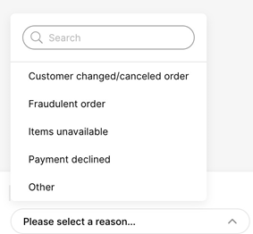
These elements render a dropdown menu where an Agent can choose a single option. In the future, there will be multiple options.
Text
{
  "type": "select",
  "placeholder": "Please select a reason…",
  "options": [
    {
      "text": "Order mistake",
      "value": "order-mistake"
    },
    {
      "text": "Payment declined",
      "value": "declined"
    }
  ],
  "optional": false
}
Select Input Fields #
| Field | Type | Required | Description |
|---|---|---|---|
| type | String | Yes | Always select |
| options | Array | Yes | Array of select-option elements |
| placeholder | String | No | String that appears in the input when it has no value |
| optional | Boolean | No | Whether the select input must have some content filled out. The form will display an error before submission if there is no content. Default is false. |
Select Option Fields
These elements comprise the options presented in the select-input dropdown menu.
Text
{
  "text": "Order mistake",
  "value": "order-mistake"
}| Field | Type | Required | Description |
|---|---|---|---|
| text | String | Yes | Text that appears in menu item |
| value | String | No | Value that is submitted as select-option value in the JSON response. If not provided, text field value will be used |
Submitting the Form #
When the confirm button is clicked in the form, an HTTP POST request is made to the url specified in the form with the elements the agent entered into the form.
POST https://your-lookup-adaptor.com/actions/cancel?orderNumber=1390
Headers
- Gladly will send a header called Gladly-Agent-Id in this request to your Lookup Adaptor. This header’s value will correspond to the Gladly Agent ID that submitted the action form on your Lookup Adaptor. In your Lookup Adaptor, you can use this header to audit who performs actions and guard access to performing certain actions to particular Agents.
- Note that Node.js (a popular JavaScript runtime environment) will represent this header key as gladly-agent-id (in lowercase) instead of its original Gladly-Agent-Id.
Text
{
  "actionUrl": "/actions/cancel?orderNumber=%231390",
  "notify": true,
  "reason": "declined"
}
The request payload will have the values specified in the form inputs.
Form Errors #
When the form is submitted, there are 3 possible types of errors.
- Validation
- Agent entered invalid data
- Permanent
- Order is no longer valid to be returned
- Other
- For example, a network timeout
Validation Errors #
Validation errors occur when the Agent needs to correct data in the form.
The form will be updated with the error text and re-displayed for the Agent to correct the information.
To show a validation error, the service should respond to the form submission with 400 Bad Request response, and a payload that looks like the following.
Text
// 400 Response - errors displayed in the form
{
  "errors": [
    {
      "attr": "value",
      "detail": "expected String to be a BigDecimal"
    }
  ]
}
Error Response Fields #
| Field | Type | Required | Description |
|---|---|---|---|
| errors | Array | yes | Array of error objects |
Error Object Fields #
| Field | Type | Required | Description |
|---|---|---|---|
| attr | String | no | The form attribute to assocaite with the error. Must match the attr of one of the form inputs. If no matching attr is provided, the error will not be displayed. |
| detail | String | Yes | Descriptive text about the error. |
Permanent Errors #
Permanent errors occur when an Agents attempts an Action that is not possible. These errors appear as a red toast notification.

For example, if the Agent attempts to cancel an order that has already shipped, this is a permanent error.
When this type of response is returned:
- The form closes.
- The Agent sees an error message.
- The detailed lookup refreshes to determine what actions remain available.
To show a permanent error, the service should respond to the form submission with a 406 Status Not Accepted status and a payload that looks like the following.
Text
// 406 - Permanent failure, do not allow agents to take action again
{
  "errors": [
    {
      "detail": "Cannot cancel a paid and fulfilled order"
    }
  ]
}
Other Errors #
These can include:
- Network timeouts
- Gladly does not receive a response from the service in 15 seconds
- 500 Internal Server Error where the service is not responding properly
- 429 Too Many Requests where the service is overwhelmed
- All other HTTP codes not enumerated above.
In these cases, Gladly will keep the form open and the Agent can retry submitting the Action.
Form Success #
Any 20X response to form submission will be considered an indication of success.
When this type of response returns:
- The form closes.
- A record of the action performed adds to the conversation history.
- The detailed lookup refreshes to determine what actions should remain available.
- If the response body contains JSON in the following format, it will render in the success notification.
Text
// 200 - Success
{
  "message": "Order Refunded"
  "detail": "Order #1391 was refunded $25.00."
}
Success Object Fields #
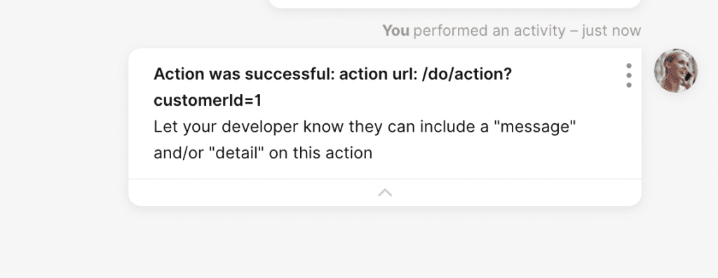
A default actions Conversation Timeline update is shown if “detail” or “message” is missing. Both must be configured to avoid the default action message.
| Field | Type | Required | Description |
|---|---|---|---|
| message | String | Yes | Bolded summary message to show in the action record. |
| detail | String | Yes | Detailed message to show in the action record.URLs automatically turn into a clickable link in the UI. Format text like bold and underline using HTML in the string using. Additional formatting like bold/underline to a URL will no longer be clickable. |


